
Boston Geographical Crime Analyses
These analyses served as the basis for the final project I submitted for a graduate-level Geographic Information Systems (GIS) course at Indiana University. I was primarily interested in examining the spatial distribution of crime in Boston as well as the correlates of crime rates. Drawing on prior research, I began the project with the following hypotheses:
- The proportion of the population that is white is negatively associated with crime rates (Liska & Bellair 1995; Blau & Blau 1982; Braithwaite 1979)
- Median income is negatively associated with crime rates (Gould et al. 2002; Levitt 1999)
NOTE: The following report highlights the findings from my analyses of Boston crime rates. To obtain the files used for these analyses, see the GitHub repository home page.
Contents
Data Cleaning and Analysis
Data Cleaning
ArcGIS Analyses
R Analyses
Concluding Remarks and Information
Limitations
References
Analyses
Data Cleaning
To prepare for analysis, I began by cleaning the crime data. Because of computer hardware and software limitations, I reduced the number of cases by selecting 20 different types of criminal incidents, keeping only those cases that contained values for latitude and longitude.
## Load dplyr package
library(dplyr)

## Read in data
crime <- read.csv("data-crime_incidents.csv")

# Remove observations with missing information (N/A)
crime <- na.omit(crime)

# Remove observations with missing spatial information
crime_filtered <- filter(crime, crime$Lat > -1 & crime$Long < -1)

# Specify crimes of interest for analysis
crimes_interested <- c("Auto Theft", "Aggravated Assault", "Larceny From Motor Vehicle",
                       "Larceny", "Drug Violation", "Robbery",
                       "Simple Assault", "Residential Burglary",
                       "Firearm Violations", "Homicide", "HOME INVASION",
                       "Offenses Against Child / Family", "Other Burglary", "Commercial Burglary",
                       "Criminal Harassment", "Explosives", "HUMAN TRAFFICKING", "Manslaughter",
                       "Burglary - No Property Taken", "Arson")

# Keep only observations with crimes of interest
crime_clean <- crime_filtered[crime_filtered$OFFENSE_CODE_GROUP %in% crimes_interested,]

# Ensure that only the 20 crimes of interest are included
unique(crime_clean$OFFENSE_CODE_GROUP)

# Export data
write.csv(crime_clean, "data-crime_incidents_cleaned.csv")
ArcGIS Analyses
After cleaning the crime data, I imported the XY point locations into ArcGIS. Using ArcGIS’ select by location tool, I then intersected the crime point data with the Census tract shapefiles, providing the number of criminal incidents in each census tract. Next, I joined in the population size, racial composition, and median income for each census tract. After normalizing the crime count data by population size to obtain crime rates (i.e. crimes per capita), I created 3 choropleth maps that depict the crime rates, racial composition, and median income of each census tract in Boston.

R Analyses
A visual examination of the choropleth maps hints toward the conclusion that crime rates are negatively associated with both the percent of an area that is white (hereinafter, racial composition) and median income. To further examine this, I examine scatterplots of racial composition and median income as predictors of crime rates. I create these using ggplot2 (below code is example):
library(ggplot2)

cor(crime$crime_norm, crime$Percent_White)

crime_plot_race_unfiltered_xRACE <-ggplot(crime, aes(x = crime$Percent_White, y = crime$crime_norm)) +
  geom_point(col = "red") +
  geom_smooth(method = "lm") +
  labs(title ="Crimes per Capita by Racial Composition", caption = "Correlation = -0.039", x = "Percent White", y = "Crimes per Capita") +
  theme(plot.title = element_text(hjust = 0.5))
print(crime_plot_race_unfiltered_xRACE)
ggsave("plot-crime_unfiltered_xRACE.png" , width = 5, height = 5)


It is clear in both instances that the regression line is heavily influenced by a few outlying observations. For instance, Census Tract 9818 has the highest observed crime rate at nearly 2 crimes per capita. However, the area is largely non-residential (only 53 residents). Every resident is non-Hispanic white and the median income is just shy of $200,000. Thus, though for most of the data there appears to be a downward linear trend, outliers like this influence the linear trend line. To account for this, I next look at those observations where crimes per capita is less than 0.5. Once these outliers are accounted for, there appears to be a clear negative association between crime rates and both racial composition and median income.
")
")
I also examined a 3D scatterplot, created using plotly, to assess both racial composition and median income as joint predictors of crime rates. The scatterplot is interactive, so feel free to examine the plot from different angles!
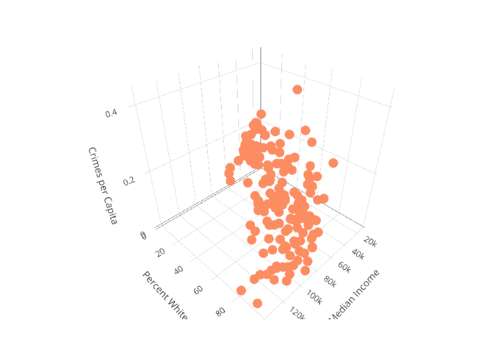
scatterplot_3d <- plot_ly(crime_filtered, x= ~Median_income , y = ~Percent_White, z = ~crime_norm,
                          color = "red") %>%
  add_markers() %>%
  layout(scene = list(xaxis = list(title = 'Median Income'),
                      yaxis = list(title = 'Percent White'),
                      zaxis = list(title = 'Crimes per Capita')))
scatterplot_3d
Lastly, I estimated a multiple linear regression model. Once both covariates are included as predictors in the model, racial composition is the only significant predictor. Thus, while scatterplots indicate that both median income and racial composition have negative associations with crime rates, it appears that racial composition is the more important predictor of crime rates, both in terms of statistical significance and the magnitude of the coefficient.
crime_multiple_lm <- lm(crime_norm ~ Median_income + Percent_White, data = crime_filtered)
tidy_crime_mult_lm <- tidy(crime_multiple_lm)
tidy_crime_mult_lm
| term | estimate | std. error | statistic | p-value |
|---|---|---|---|---|
| (Intercept) | 1.631369e-01 | 1.170969e-02 | 13.9317845 | 1.659674e-29 |
| Median_income | -7.796539e-08 | 2.225944e-07 | -0.3502576 | 7.266004e-01 |
| Percent_White | -9.397176e-04 | 2.331348e-04 | -4.0307913 | 8.535178e-05 |
Limitations
The above analyses should be interpreted in light of a few important limitations.
- As outlined above, due to hardware limitations that precluded using the full crime data, only certain crimes were included in these analyses. A more thorough analysis that examines all crime data would yield a more detailed understanding. Further, because crimes are aggregated, the above analyses don’t examine crimes by type, such as property crimes and violent crimes.
- An area’s crime rate is certainly a function of more than just racial composition and median income. A more nuanced analysis would account for more of these relevant characteristics.
References
- Blau, Judith and Peter Blau. 1982. “The Cost of Inequality: Metropolitan Structure and Violent Crime.” American Sociological Review 47(1):114-129.
- Braithwaite, John. 1979. “Inequality, Crime, and Public Policy.” Boston, MA: Routledge & Kegan Paul.
- Gould, Eric, Bruce Weinberg, and David Mustard. “Crime Rates and Local Labor Market Opportunities in the United States.” The Review of Economics and Statistics 84(1):45-61.
- Levitt, Steven. 1999. “The Changing Relationship between Income and Crime Victimization.” Economic Policy Review 5(3):87-98.
- Liska, Allen and Paul Bellair. 1995. “Violent-Crime Rates and Racial Composition: Convergence Over Time.” American Journal of Sociology 101(3): 578-610.